For this exercise, you will need either Photoshop (or some other similar graffic application) or a light-box and lots of paper. I recommend Photoshop and some kind of wacom tablet, preferably a syntiq. However, for this exercise, I used only a basic tablet on my laptop mac.
STEP 1)
On a new layer, sketch out some shapes to build your character. The simpler, the better, as this character is being designed for cartoon animation.
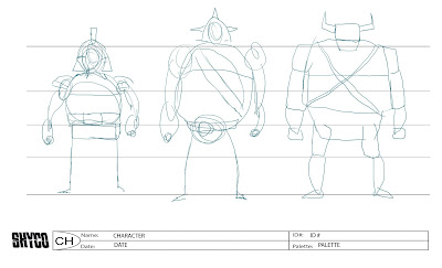 STEP 2)
Reduce the opacity of the sketch layer.
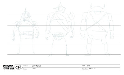
STEP 3)
Design your character. I prefer the straight on view first, however, the industry is primarily looking for the 3/4 front, as most characters on-screen are regularly in this view. Although, for the turnaround, I will create the 3/4 front from the straight on front, so it doesnt matter.
(it only matters if you are NOT going to do the turnaround.)
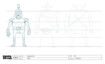 I like to use a color in my line, usually something bluish. This is my preference, though you can use whatever you like, of course. The reason is that i can use different colors when updating or correcting later and colors easily differ from the black line I will use in the clean-up... but again it doesn't really matter. In the end, you will reduce the opacity of your rough during cleanup anyway.
tip: I did a little cheat here and copied the left arm and flopped it onto the right to give the limbs some symmetry.
If you are using a lightbox, a scrap paper sheet is handy to trace onto and off of again.
STEP 4)
Turn off your sketch. Reduce the opacity of your rough. Create a new layer, and draw your 3/4 right on top of your Straight pose. Try to keep the shapes and proportion identical, and simply move the center line over. Adjust your curves in alignment with this new axis.
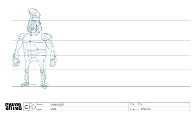 Tips: You might redraw the arms exactly, but maybe turning some of the details a little (like the arm hairs and the wristband details). Then, adjust the positioning and scale slightly. The right arm (or close arm) is moved in closer to the chest, while the shoulder is clearly in the forefront of the body. Also, I increased the size to 105%. The Left arm (or far arm) is decreased in size to about 95%. This trick kind of simulates a foreshortening effect, while maintaining the accuracy of the design. Also, this trick is harder to pull off with a lightbox.
STEP 5)
Move the design over and decrease the opacity. Create a new layer and draw your profile view right on top of your 3/4 front.
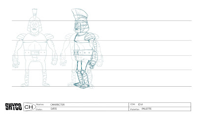
This view is the most drastically different of all the views. This is where your drawing skills and talent are really tested, I think. Drawing right on top has the advantage of helping you line up all the features accurately. Be sure to pay attention to the feet that they are planted on the same plain.
STEP 6)
Move your profile design over. Take your 3/4 view and flop a copy of it to use as a foundation for your 3/4 back. Move it over to the far right of your lineup and maintain a low opacity.
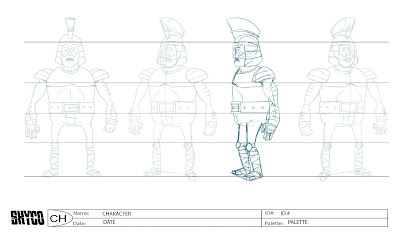
Basically, you have to imagine the back and how you can fit it into the silhouette. this might be challenging the first few times, but once you get the hang of it, you will find it pretty basic.
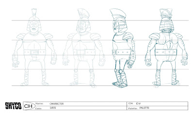 I composed this figure facing to the left, however you can try facing him to the right as well.
on a seperate layer, I used the first 3/4 view as reference for the crest of the helmet and just moved it over and superimposed it.
The biggest challenge here is redrawing the feet onto the same plain.
STEP 7)
Now, turn off your 3/4 reference. Align and space your designs appropriately. Create a new layer underneath the design layers and with your lasso tool, make a selection in the shape which best encapsulates each design and fill it with white to mask out the lines on the template. I prefer to make a folder for each view which I keep the"mask" layer for each design separate for the others.
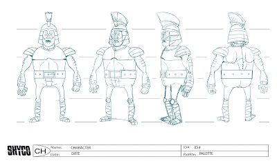
If you like, you can add one last view, but its not really necessary. This view would be the straight back view. I am sure you can figure out how to do that after following through on the 3/4 back view.
Now that you have you're character turnaround rough, you can proceed to ink it or "clean up". If youre using a tablet, you might want to explore using the path tool in photoshop, as it will give you some nice clean lines and curves and also there is an option to vary the width of the line which can give a dynamic look. otherwise, if youre using a syntiq, tracing it is a breeze with the brush tool.
IN CONCLUSION)
I hope this is helpful and inspires you to create a shitload of turnarounds that will land you a job designing characters for whatever industry you have your heart set on.
ART TEAM GO!

No comments:
Post a Comment